The Importance of Live Text in Email

Imagine a subway commuter on his cellphone with barely any signal. He’s trying to read an email from his favorite shoe brand, but none of the images will load. And because there’s no live text in this message, he has no idea what this brand is trying to tell him. Is there an exclusive sale? A brand-new line? In frustration, he deletes the email.
Now imagine that was your company’s email he deleted, without even knowing what it actually said. You’ve just lost the potential for that sale and that experience may affect how he interacts with your brand moving forward.
As with any mobile or website, people are only willing to stick around so long before moving on. In fact, if they do not receive the results they want within 10 seconds, you’ve most likely lost your chance of winning them over.

That’s exactly what we don’t want to happen.
But how can you avoid this unfortunate situation? You can’t help that the service in the subway had a bad signal -- or can you? Let’s take a look at how live text can improve your email experience.
When you think about starting the design for an email, it’s easy to put on your creative cap, hop into Photoshop, and go to town. But with mobile on the rise, it’s extremely important to not only create beautiful content but also functional and responsive emails.
Having text inside images may look beautiful, but when it is viewed on a mobile device, the text scales down making it difficult to read. And in Mr. Commuter’s case, the images didn’t load so he couldn’t read the text at all -- not a great experience.

Here’s a quick glimpse at what we’ll cover in this article:
- The solution: live text
- How to improve customer experience
- Adding text to an image
- How to call out categories with live text
- Creating banners that incorporate your live text
So what’s the solution? Live text.
No matter where in the world your reader is opening your email, whether it’s on the subway with limited cell service or in their home with a full Wi-Fi connection, HTML text (or live text as I’ll call it) will maintain a readable size. Live text can identify the need to simply wrap to a new line if necessary, and will display even when images don’t -- meaning our commuter would have been able to at least make out the text our of promotion.
This balance of beauty and function has blossomed into one of my favorite things: creative ways to incorporate live text. With Listrak Composer by your side, you can create stunning emails without needing to learn all the quirks of coding for inboxes. Here are a few tricks to improve the user experience with Listrak’s Composer messages by implementing live text in your email strategy.
4 Tips to Improving Customer Email Experience With Live Text
1. Add text within an image -- yes, it’s possible!
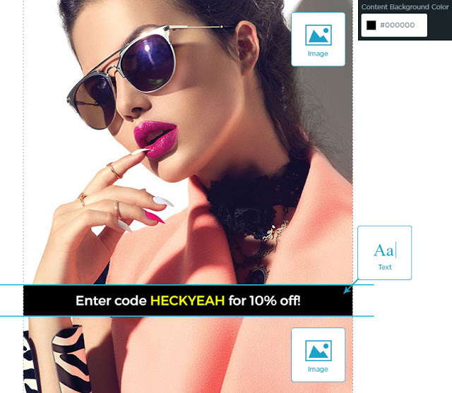
If you have a great image for your hero, it is actually possible to include text in that image. You just have to get a little creative with it.
The Listrak Composer lets you create an image with live text build in. In this case, a solid-colored box was added on top of the image, slicing it into two parts: above the box and below. Our tool lets you stack the top half of the image, add the text box area, and then the bottom half of the image. You can add text by simply selecting the structure for the area and adding a content background color. Voilà! Your test email will now display the text in an easy-to-copy and mobile-friendly manner while maintaining a fantastic aesthetic.

2. Create Live Text Unique Headings
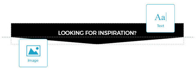
Looking for something a little more intriguing for your headline text? You can create a headline combining the powers of an image and a content structure with a background color. In this example, you’ll notice a rectangle content structure that has an image placed below it to create an arrow.
Now instead of shrinking, your headline text will flow on mobile and remain readable. And bonus! This headline uses a directional cue (the arrow) to draw the reader further down into the email. This is a great design tactic for longer messages because it will entice your user to scroll down to see what the arrow is pointing to, like a promotion or coupon code.

3. Have Fun With Your Categories
Want to call out apparel, shoes, and accessories without taking up too much real estate in your email? Then the Composer’s two-column structure is perfect for your goal! There are a number of things you can do with this structure to call out those categories while incorporating live text.
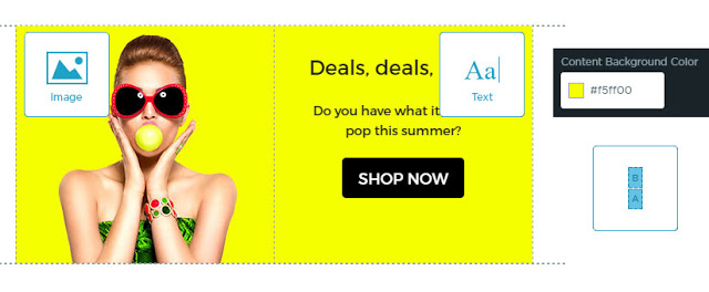
In this example, in particular, there is an image in one column and live text (i.e. the category name) in the other. You can even messed around with the shape of the images in Photoshop to create an angled corner for an extra design flare. This finished product not only features the vivid imagery customers love, but the functionality of live text to make their experience flawless with or without those images.


See! Combining imagery with live text is much easier than you ever imaged. You don’t have to be a code-wizard to figure this out -- and it looks great on nearly any layout.
4. Create a Secret Banner
Though this may look like one whole banner, it’s really another two-column structure. Again, there is an image in one column and text in the other. But this time, instead of leaving the background of the text white, I made it the same bright yellow as the accompanying image. Now it looks like one whole banner! An easy trick that will be nearly impossible for your customers to notice.
To improve the experience on mobile, I set the mobile settings to reverse stack. Now when the reader scrolls, they’ll see the text first and the image second -- making sure they get all that important information you’re sharing with them.

Can you tell from these images that the text is separate from the image? Just another great example of how live text can be added to the design but still work to your advantage.
Implementing Live Text in Your Email Strategy
Before reading this article, you might have thought live text emails were out of reach -- after all, HTML can be very confusing. But with the help of Listrak Composer, it’s never been easier.
While these are just a few examples of ways to incorporate live text into your email messages, hopefully they help kickstart some ideas for your next email designs.
Learn more about how Listrak Composer can boost your email conversions


.svg)


.png)

