The 10 Most Important Email Design Best Practices


What makes an email marketing campaign successful? There are a lot of different stars that must align to optimize conversions and revenue, but one great place to start is your email design, especially if you are working remotely and need to make sure your emails look good and function well on all devices and screens.
Failing to ensure you are utilizing best practices for email design could result in:
- Copy that is unreadable
- Images that are blurry or take too long to load
- Hidden calls-to-action
These are all things that can not only render your message (and efforts) useless but can be detrimental to your brand reputation.
While design trends may shift from year to year, email best practices tend to remain more standard – and we have made it easy for you to find them all in one place! So, whether you are an experienced email graphic designer, or you are brand new to this corner of ecommerce (welcome! 👋), here are the 10 best practices for email design that you can start implementing today to optimize your email marketing for conversion.
1. Designing Emails for Dark Mode
The use of Dark Mode for email is on the rise as more users find it easier on the eyes. The challenge? Not every email client or mobile app handles Dark Mode in the same way.
There are three ways that Dark Mode for email is handled:
- No Change
- Partial Inversion
- Full Color Inversion

As you can see in these examples, partial and full inverts can cause a few problems. Dark logos can disappear in the background, text contrast ratios can make copy unreadable, and colors can stray from your brand guide.
How can you avoid Dark Mode for email mishaps?
- Use transparent imagery – Add a soft stroke or outline to PNGs (such as a logo). This makes sure the image or element will stand out against the background.
- Crop non-transparent imagery thoughtfully – Make sure there is enough space around surrounding text to maintain legibility.
- Use live text – Live text will automatically invert within Dark Mode to remain readable against the background.
💡 Dig a little deeper! If time and skill sets allow, there are two tactics within CSS that can be leveraged to better support Dark Mode. Listrak clients can learn more in our Dark Mode & Email Design resource found in the Listrak App (Help & Support > Creative Resources).
2. Email Accessibility Compliance Standards
The World Health Organization estimates that over 2.2 billion people live life with a visual impairment (WHO) and it is estimated that around 2.3% of the US population needs some form of assistive technology to read web pages (accessiBe). Email accessibility and inclusive design are imperative to reaching your entire audience.
There are 3 levels of compliance:
- A – Essential (the lowest level)
- AA – Ideal (the standard)
- AAA – Specialized (required in Healthcare, Finance, Government, and Hospitality)
Listrak recommends that you always try for at least AA compliance.
Here are a few ways to ensure email accessibility:
- Include Alt Tags with all images – Be descriptive for those who cannot view images.
- Use live text instead of text within images – This allows screen readers to read it.
- Make sure font sizes are at least 16px for paragraphs and line height is at least 1.5x the font size.
- Left-align paragraphs that are longer than 2 lines – Center aligning can be more difficult for those with cognitive disabilities to read.
- Use a contrast ratio of 4.5:1 or higher for text to background color. (7:1 for AAA compliance.)
💡 Whocanuse.com is a great free tool for checking contrast ratios, as well as to verify colorblindness accessibility.
3. Content Hierarchy for Emails that Convert
Every good story has a beginning, middle, and end – the same can be said for an email. Your content hierarchy (i.e., how you structure the content within your email) needs to be intentionally built based on the goal of your email.
The most important part of your email should come before the scroll. Use this space to deliver the main message and call-to-action of the email without the reader having to scroll.
💡 Remember the Serial Position Effect – When presented with a list of words or information, the tendency of the reader is to remember the first and last but forget the middle part.
As you build out the rest of the content in your email, keep in mind:
- Use visual cues that help readers move through the email (e.g., arrows, pointed imagery, GIFs with movement, etc.).
- Intentionally separate sections of content – Use color, dividers, or images to break up sections. On the other hand, make sure that pieces of content that should go together are visually cohesive. If you are struggling to create sufficiently high-quality, uniform visuals, using the best AI photo enhancer can help. It takes the hassle out of producing consistently solid materials to enhance each campaign.
- Do not overstimulate your reader – Too many areas of focus can cause your reader to get lost. Remind yourself, “what is the action I want the reader to take?” and make sure you have laid a clear path without too many distractions.
4. Designing Your Copy Layout
Current research shows that ~41% of readers will skim your email, with ~25% only glancing at it. On top of that, the average read rate is about 9 seconds (Litmus), and declining. A subscriber might not read every word in your email, and that is okay. The most important thing is that subscribers can easily find and ingest the content important to them.
Make your copy easily scannable by:
- Chunking your content with clear and bolded headlines.
- Using bullets when presenting information.
- Setting up your content in accordance with one of the common reading patterns.
💡 The F-shaped reading pattern is one of the most common. Readers will read the first few lines, skim down the left until they find something of interest, then read a few words, and so on.

5. Using Images in Email
From inviting hero images to enticing product images, imagery can really elevate the impact of an email. However, if done incorrectly, the opposite effect can occur. If you want a crisp design without distractions, learn how to effortlessly remove picture background.
Avoid This:
Blurry and fuzzy Images (especially on retina and HD screens).
By Doing This:
Export your images with dimensions that are twice the size of what you will be using. For example, if using a 200x200px image, export it at 400x400px.
Avoid This:
Large load times caused by large file sizes.
By Doing This:
Keep the max file size your email to under 300kb (under 100kb is ideal). Remember – subscribers will not wait for your message to load.
💡 Use an image compressor like Squoosh or Tinypng to retain the quality of your images without maxing out your file size.
Avoid This:
Losing impact if images do not download (or if read by a screen reader).
By Doing This:
Include Alt Text, especially if there is copy within the image.
Make sure it matches the content of the image, but limit character count to 140 characters to avoid clipping.
P.S. While images are the standard, never underestimate the impact that a plain text message can have in certain circumstances.
However, if you're looking to enhance your visual communication, Freepik provides a wide range of images, illustrations, and graphics for personal and professional projects. Plus, they even offer free white backgrounds for your projects.
6. Adding Videos & GIFs to Email


Looking to add some movement to your message? Want to tell a story using little space? Thinking a 360-degree view of your product could be beneficial? Videos and GIFs can do the trick, but there are two major things to consider:
Not all email clients support videos and GIFs.
Always make sure to set a fallback image. This is what will display if the video or GIF cannot play.
💡 Instead of embedding videos, consider using a still of the video with a play button over top that links out to the video instead (preferably on your website, where they can continue to shop!).
To create an eye-catching still image with a play button overlay, try using BeFunky's Photo Editor. This user-friendly tool provides various design elements and customization options to help you craft the perfect visual for your email campaign.
Videos and GIFs can significantly increase your file size.
With images, we talked about a max file size of 300kb - Your video/GIF file size adds into that as well. Use compression software and remember that small and simple can still have a significant impact.
7. Strong Call-to-Action Buttons
Notice that you have a high open rate, but a low CTOR? The culprit might be a weak call-to-action. If readers do not see a clear call-to-action that catches their attention while skimming, they are not going to take the action you want them to – possibly defeating the purpose of your email campaign.
Strengthen your calls-to-action by:
- Making them relevant - Maybe it sounds self-explanatory, but you need to make your calls-to-action relevant to get your customer’s attention. If, for example, you want to sell custom-made photo books, a CTA of “create your photo book” would be the best option.
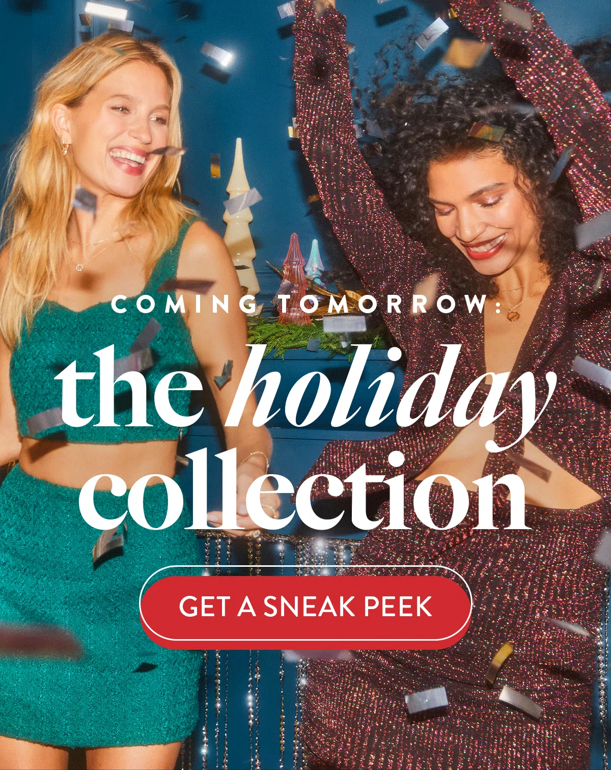
- Making them stand out – Your call-to-action should draw the eye using color and shape. Rectangular and “pill-shaped” buttons tend to be the most popular button shapes but do not be afraid to experiment with different treatments (especially around the holidays).
- Making them easily clickable – Buttons should be at least 44px wide. This will especially ensure that your call-to-action scales appropriately for mobile devices.
- Using strong action words – Avoid the “Shop Now”s when possible. Describe the action you want the reader to take and/or the benefit they will receive.
💡 Using “me” language can be more impactful than “you” language because you are speaking from the reader’s point of view. Example: “Download My Free Book” vs. “Download Your Free Book”


8. Optimize Your Email Header & Footer
Headers and footers can take many different forms, but here are a few things to consider:
- Keep logo sizes to a minimum – Remember, you want the space above the scroll (the top 350px) for your most important content. Furthermore, refining your logo design for smaller sizes will ensure that it stays clear and visible even when viewed on tiny displays or in low-resolution formats.
- Do not overwhelm with your navigation – Putting too many links in your navigation can make your email look too busy right from the start. Focus in on 3-5 links – you can always change them out seasonally.
💡 Consider moving your navigation to the footer to free up even more space at the top, keep a clean aesthetic, and get right to your content. - Create your headers and footers using Saved Content - This will allow you to keep multiple versions for different campaign types, as well as allow you to easily update across messages. (Learn more about Saved Content on the Listrak Help Center)
What information should be in my footer?
To meet compliance standards, it is recommended* to always include:
- Physical Address
- Method of contact (phone, email and/or link to a “Contact Us” page)
- Unsubscribe link (should be able to unsubscribe within 2 clicks)
*At Listrak, we help our retailers and brands stay compliant with their messages. Our design experts follow best practices to ensure messages that we create meet compliance standards.
9. Designing Emails for Mobile Optimization
Consumers and their mobile phones are inseparable, and we have the stats to prove it.
- 41% of email views in 2021 were from mobile devices. (HubSpot)
- ~55% of global website traffic is generated from mobile devices, excluding tablets. (Statista)
- Launching a mobile-responsive email design can increase unique mobile clicks by 15%. (MailChimp)
Use these mobile-friendly best practices to optimize your emails for mobile devices:
- Have a mobile-first mindset – Think about mobile optimization from the get-go. Rather than designing your entire email and then just shrinking it down for mobile, design your email with your mobile users in mind. This means choosing a layout that works best for mobile.
- Consider a single-column layout – This will make your email content much easier to read on mobile devices. If you use a multi-column layout, just be cognizant of how content might stack on mobile devices.
💡 When testing your emails for mobile optimization, test on the smallest screen in use – currently the iPhone SE at 375x667px. - Use live text – We've covered the benefits of live text for screen readers and dark mode, but it is also favorable for mobile devices. Live text will scale appropriately for smaller screens so your text will keep its readability.

10. A/B Split Testing for Email Optimization
Question: What is the best way to understand what email designs are most likely to convert with your specific audience?
Answer: A/B split testing!
With A/B split testing, you can pit two different versions of a message element against each other to see which one performs better. While you could theoretically test completely different messages, the true objective is to isolate one specific variable to see how that variable affects conversion rate, open rate, or CTOR.
Examples of things you might A/B split test in email design are:
- Calls-to-action – Testing different button colors, text, or even locations such as placing the call-to-action button at the top of the email versus at the bottom, within the email signature, or within the body of the email.
- Subject lines – Testing the use of emojis, personalization, or subject line length.
- Content placement – Testing the location of product recommendations or promo codes.
- Use of videos, images, and GIFs – Testing whether using a GIF increases conversions or testing varied sizes of hero images.
- Headers – Testing different links within headers, moving the links to the footer, or whether you even need header links.
- Content pieces – Testing whether a banner about financing options or a banner about free shipping leads to more conversions from your cart abandonment email.
💡 New to A/B split testing? Check out the Listrak Help Center to explore what you can accomplish with Listrak’s split testing feature.
Optimize Your Email Marketing with Listrak
Not only can you deliver seamless, personalized cross-channel interactions (all from one integrated platform) with Listrak, but you also get access to industry experts with one goal in mind – helping you execute growth strategies and exceed goals.
Schedule your personalized demo today and join the 1,000+ retailers recognizing ecommerce revenue growth with Listrak.
Let’s Get Started >
https://www.listrak.com/get-started


.svg)


.png)

