


Responsive Design: Retina Images
In a recent webinar, I discussed Listrak’s approach to responsive design and mobile engagement with best practices for navigation, text size, stacking and resizing content, retina graphics, and the use of media queries for mobile styling. There were many great questions asked by our viewers following the webinar, but the two topics that were most popular seemed to be retina images and stacking content. In the paragraphs to follow, I will review these topics and provide a clearer understanding of how they work and why they’re important.
Retina Images
You may not realize it, but you probably look at a retina screen every day. Most smart phones, tablets, newer models of laptops and even desktop monitors have high-resolution displays. These high-res displays jam 2 or 3 times the number of pixels into a small screen, enhancing the quality of photos and making text clearer and easier to read. However, we need to make sure our graphics, text, and photos are optimized for these higher density screens.
The most common pixel density for retina is 2x, meaning there are 2 times the number of pixels per inch. A screen that is 320 pixels wide will be 640 pixels across, and because of this, images need to be double in size to appear crisp on a retina screen. Images that are not scaled correctly will appear blurry and unfocused on a retina screen. A 200px wide image needs to be 400px wide to match this resolution. In email, we achieve this clarity by doubling the size of important graphics as well as images that contain text.
Below is a sample Listrak email. The first example shows the Listrak logo and social media icons saved at their normal size; note how they look blurry on a smart phone with a retina screen.
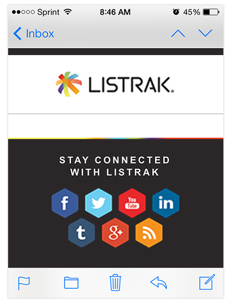
When the images are saved at double their natural size, they will be optimized for the 2x resolution of a retina screen. It’s important to note that images must be large enough to be saved at double their natural size, or be vector graphics that can be scaled without distortion.
The Listrak logo, for instance, is being forced to display at 175 x 38, but the natural size of the image being referenced is actually 350 x 76. A retina device will be smart enough to use the larger referenced size, yet still display the image at the size specified in the <img> tag.
Consider the file sizes of your images. Make sure when saving for web that you choose the most appropriate file type and quality. Gifs are typically better for flat graphics and text, while Jpgs are better for photos. Doubling images for retina will increase the file size of your email and cause a slower load time if it isn’t optimized correctly.
This final example shows an image that is large enough on the desktop version of the email to scale to half its size on mobile and be optimized for retina.
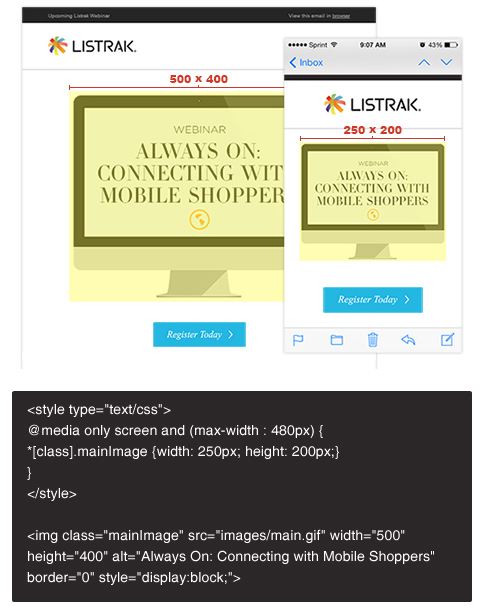
The desktop image is being displayed at 500 x 400. A media query was added to style our email for screen sizes less than 480px, and a class of mainImage was added to the <img> tag. Now we are able to style the class with CSS so that our image will shrink to 250 x 200 on a mobile screen — half the size of the image’s natural size — and also be optimized for retina.
Any questions? Let us know in the comments section.


.svg)


.png)

.png)