HTML Email Design Best Practices: The 10 Golden Rules

Responsive email design is very important when you consider there are literally billions of emails sent each day. HTML email design comes into the picture because not every person will open their emails the same way. Some will open them on a desktop and many more on a mobile phone -- but no matter how they open it, they need to be able to read it.
Without the right HTML design, you may find your click-through rates are dropping and your customers aren’t having a great experience with your branded content.
Here’s the good thing, we get questions around email design all the time. So to help you navigate the HTML email design world here are some tried-and-true best practices that seem to stand the test of time. Use these as the baseline for any HTML email design or template to create engaging messages that perform well across devices and browsers.
1. Identify Yourself
In a world where spam emails are more common than not, it’s important to identify yourself. With 45% of emails identified as spam, it’s important your messages don’t come across as a potential threat.
To ensure your customers know your email isn’t spam or junk mail, include your brand name in the From Name field and use a recognizable From Address. Clearly identifying yourself right away allows your customers to know the email is from someone they trust, and want to hear from. This is not only a best practice but will also help you remain compliant.
2. Size Matters
There are multiple elements within your HTML email design where you need to consider the size. From character limitations for subject lines to proper image sizes -- you need to pay attention to these sizes:
- Keep your Subject Line and Preheader under 65 characters to ensure that they fit no matter what browser, email client or device is used.
- The ideal email width is 600px wide to render properly on all devices and browsers.
- Keep images crisp but optimize for load time with a resolution of 72 dpi.
3. Design for Mobile Users
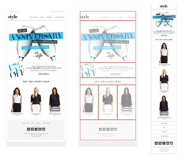
55% of emails are now opened on mobile devices. This means that you can no longer ignore the idea of designing for mobile devices. Utilize a grid layout so your email neatly stacks, scales and stays organized on mobile devices. Listrak Composer lets you set up both desktop and mobile versions with a simple click of a button.
4. Get More Clicks with The Right Buttons
Use eye-catching, high-contrast CTA (call-to-action) buttons to let subscribers know to click-through for the good stuff.

Try switching-up the words in your buttons. “Shop Now” and “Learn More” can work well, but play around with more creative options to build curiosity and lure users into clicking-through.
Maximize clicks by making your buttons “bulletproof.” This means making them HTML rather than images so they still display when images are turned off in someone’s inbox (which is usually about 50% of the time). Make sure to use a web-safe or Google font.
If you go the image-based-button route, make sure that when it shrinks for mobile devices, it’s still large enough to be legible and clickable.
5. Save Above-The-Scroll Real Estate
Keep the header area of your email clean and clutter-free. Most inboxes support up to 90 characters of preheader text, which is what you see after the subject line in inboxes.
On mobile, hide the preheader area to let your important promotional content shine. With Listrak Composer, you can set this up with a single click.
6. Pare Back The Navigation
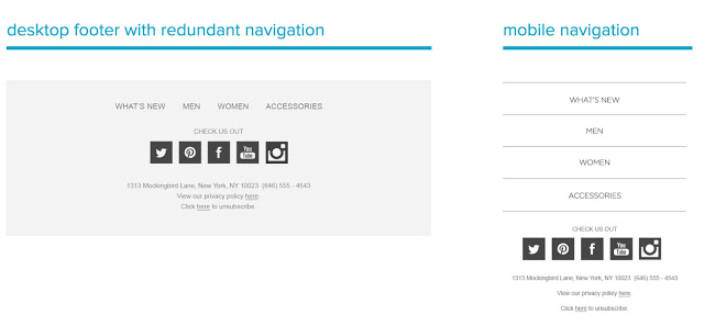
Use short navigation (max. 5 items) so you don’t distract from the most important parts of your email. While navigation can be helpful in some cases, it can clutter an email and confuse users of where they should click next.Consider (and a/b test) not using navigation at all – not every email needs one!

On mobile, move the navigation to the bottom of the message and stack it neatly above the footer to save space while remaining clickable. Listrak Composer lets you choose this option and select different layouts for desktop and mobile versions.
7. Optimize with HTML Text
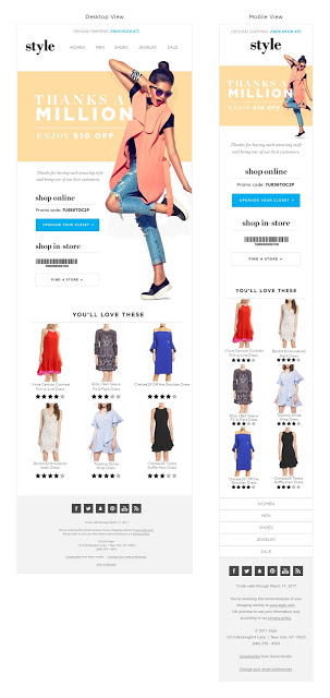
HTML text is good for copy-heavy areas to make sure it’s crisp and legible in all inboxes – desktop and mobile (HTML text will scale up and down depending on device width). Keep in mind, the minimum legible font size for most mobile inboxes is 13px.
When including a coupon code, type it out as HTML text so the user can copy and paste it easily. This will also make sure it displays when images are turned off in their inbox.
If you have to save copy as an image, send a test to yourself before you hit send to ensure that it’s crisp and legible.
Thoughts from An Email Designer
Typography is quite possibly the most important element in an email’s design, and here’s why: fewer than half of all emails are opened with images turned on. That tells us that incorporating live HTML text into an email design is a necessity in today’s multi-device, multi-browser world. While using alt text can help, leaning on HTML text is the most bulletproof way to deliver your important message to as many people as possible.
Unlike the olden days of email design, we’re no longer tied to simple fonts like Arial and Times as our only HTML text choices. We can now play with custom fonts and other web-safe choices to enhance our designs and stay brand-appropriate. This is great news for any email designer who wants to enhance the style of their emails while keeping user experience in mind.
8. Fonts Everywhere
The first rule of HTML text: every inbox will render fonts differently. In our technologically changing world, this is just something we designers have to get used to. But there are ways to make sure every recipient receives the best email possible, even if a custom font doesn’t render exactly as you’d hoped.
Web-Safe Fonts
There are a variety of stylish, user-friendly, web-safe fonts. Fonts that come preloaded on most computers render consistently over 90% of the time. Others have less wide support but still have their advantages and can be used in a font stack as long as you have a more supported font as a backup.
Sans-Serif Fonts
71%+ Renderability: Very Consistent Support
- Arial
- Arial Black
- Tahoma
- Trebuchet MS
- Verdana
1%-70% Renderability: Average Support
- Candara
- Century Gothic
- Gill Sans
- Lucida
- Lucida Sans
Serif Fonts
71%+ Renderability: Very Consistent Support
- Courier
- Courier New
- Georgia
- Palatino
- Times New Roman
1%-70% Renderability: Average Support
- Book Antique
- Cambria
- Garamond
- Lucida Bright
- Baskerville
Choosing Good Fall-Back Fonts
Remember what we said about fonts rendering differently across inboxes?
Inevitably, your custom font isn’t going to render perfectly everywhere, but don’t panic. There are ways to make your design shift subtly and purposefully as it hits less-supportive inboxes.
One great way is to control the fall-back fonts that will display when your custom font does not. Here are two prime examples:
- sans-serif: Trebuchet MS, Verdana, Helvetica, Arial, sans-serif
- serif: Georgia, Courier, Times New Roman, serif
Yes, the options are somewhat limited, but you can still make deliberate choices that support your optimal font and will help improve your conversion rate. Above all, remember that using HTML text is critical to your email’s success, so it’s worth having to put up with slight changes in styling.
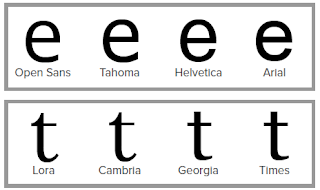
When deciding, consider that some fonts have more space between letters, others have a thicker stroke, and there’s always the serif vs. sans-serif choice. Think about these factors and choose one that won’t vary too much as it displays in less-supportive inboxes.
As an example, here’s how one letter’s styling varies from font to font:
9. Background Images
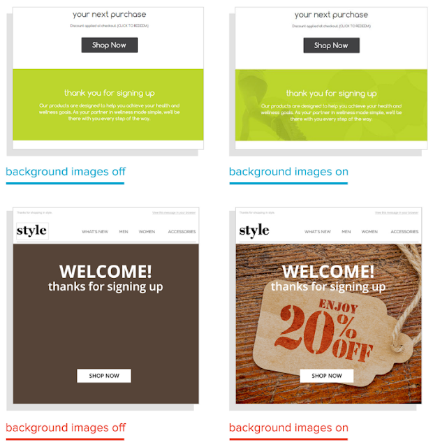
When designing emails, integrating visually appealing templates can support a clean look, particularly if images are turned off. You can use design tricks to keep recipients engaged. For such email elements, don't hesitate to explore templates that align with your overall campaign strategy.
If using a background image, keep it simple. Using a simple grid layout is best, and don’t include complicated graphics that distract from the copy on top.
Since background images won’t display when images are turned off (which is about 43% of the time), don’t include anything important to the goal of your email. Remember to include alt text which provides context if the image is blocked and assign a complimentary back-up background color to display.
10. Keep it Engaging
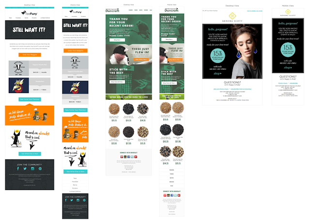
Even within the restrictions of a grid layout, you can get creative with interactive GIFs, engaging copy and layouts with angles and color blocking to intrigue. Use these elements to guide the reader’s eye to take an action and click through.
Use These 10 Golden Rules to Improve Your HTML Email Design
Whether your brand new to the world of HTML email design or you’ve already designed hundreds of emails, it’s always good to have a refresher. These tips and tricks will help you improve your current HTML design to create a better user experience for your customers.
Remember that even the smallest elements that go into designing your emails can make a big difference for the customer receiving it. Take a step back and make sure you aren’t missing one of these important HTML rules in your email marketing plan.
Interested in learning more? Contact your Account Manager for details.


.svg)


.png)

