


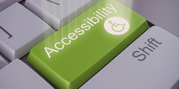
The Importance of Optimizing Email for Accessibility
For designers, there are many things to remember when creating an email. Often the forgotten question is, sadly, “Is this accessible for all my subscribers?”
That question is just as important as the rest: How will it display on mobile? Does it appeal to my target market? Will this work in all inboxes? Will it work for every subscriber?
For starters, let’s talk about what accessibility is (just in case you’re a little fuzzy). Accessibility is optimizing your designs for people with disabilities to ensure they can understand, navigate, and interact in a similar manner to a fully-abled individual. These disabilities would include blindness, poor eyesight, color blindness, dyslexia, mental disabilities, and physical disabilities.
In fact, my inspiration for this article was my extremely color blind husband. He was trying to play a video game called “Red Dead Redemption” one evening. The small map in the corner of the screen showed a red line to follow to the destination on top of a tan background. I could see everything clear as day, but he couldn't. I spent the evening watching that little map and saying “Ok, go straight. Turn left. There’s another turn coming up. Wait, no! Not that left. The other left.” He couldn’t even tell the map had changed.
It's for people like my husband that email designers should be keeping accessibility in mind during the design process. Over 18% of Americans have a disability and over 8 million Americans have vision impairment (including poor eyesight, blindness, or color blindness). So, the next big question: Are you ready to optimize your emails for them?
While it may not be possible to completely replicate the normal email experience for all recipients, we can all try our best to get as close as possible! Here are a few tips to keep in mind.
Contrast is your friend
To help those with poor eyesight and color blindness, there are a couple things to keep in mind.
- Color combinations
- Contrast
Those with color blindness have difficulty seeing certain color combinations, the most common being green and red. Avoiding those color combinations that would make it difficult for them to read is extremely important in design.
When designing, also keep contrast in mind. Check out the contrast between letters and their background color or image and ask yourself, “Is this easy to read? Is there any way I can make this better?” If you are struggling to read something, imagine someone with poor eyesight trying to read it!
If you are curious on how your images look to varying types of colorblindness, there are free simulators online. For the following example, I used Coblis.
Here, I created a simple text link in a nice rich red tone. When reading through, the obvious difference helps the viewer to realize it is clickable.
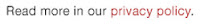
However, running this text through a colorblindness simulator tells a much different story. If I had Monochromacy, this is what I would see:
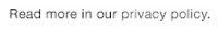
Sometimes to stay on brand, you can’t just change color palettes. A simple solution to this example would be to underline the link text as a clear indicator that the words “privacy policy” are a link.
Easy to skim, easy to scan
I’m sure you’ve heard of Agatha Christie, the best-selling novelist of all time. But did you know she was actually dyslexic? Dyslexia is the difficulty interpreting written words, letters or symbols, often resulting in the confusion or transposition of letters or words while reading.
To help those recipients with dyslexia, make sure you maintain a logical order of elements in your layout. Elements should be arranged to be viewed left-to-right and top-to-bottom. Make sure the layout also makes sense in the mobile version too! A clear hierarchy with help the user navigate through the content with ease.
Large amounts of text may also be daunting to those subscribers with dyslexia or difficulty reading. When designing, there are small things you can do to make large sections of text easier to read for everyone:
- Make your fonts at least 14px with adequate line height. Very small fonts will be difficult to read for people with poor eyesight.
- Choose a simple serif or sans-serif font for your paragraphs. Verdana and Georgia were developed specifically for on-screen readability, but there are many web fonts that offer great readability without sacrificing style or branding. Be sure to choose a typeface with well-spaced letters and clear letterforms.
- Large paragraphs of text should be left aligned. Center aligning makes the copy more difficult to read, skim, and comprehend. Your paragraphs should flow naturally for the eye.
Be smart with your animations
Gifs are a fun addition to your designs that can make an otherwise static image come alive. However, when creating or using gifs in your message, keep those who experience photo-sensitive seizures in mind. Avoid flashing content such as animated gifs with fast or harsh transitions. Keep important text out of those animations as well, so the viewers can easily comprehend and understand the content of the message.
Screen Readers
For those with the inability to read a screen, screen readers are their best friend. These tools will read HTML text and alt tags aloud for a user, allowing them to navigate an email more easily. These recipients cannot skip through content the same way a traditional user skims, so balancing your text and images will create a good experience for them.
Screen readers highlight the importance of including alt text on all images containing text, as well as the need to use live HTML text for vital information in the message. It’s also important to use meta tags to determine the character set to avoid any confusion or incorrect characters. Within the <head> tag of your email, simply place the following meta tag:
<meta charset="utf-8">
Additionally, most emails are built with nested tables. Screen readers will read each table, column, and row. By adding role=”presentation” to the table tag, the screen reader knows to only read the contents, not the containers.
Your subscribers are extremely important to your brand (and your sales numbers!). Just a few small changes can improve your email experience for all your subscribers, helping increase overall user happiness and brand loyalty.
Which of these accessibility tips will you start using in your designs? Let us know in the comments!


.png)
